After 10 years, finally designed a new logo and animation for BZwork
I made the original one in 2013 and loved it for several reasons:
It was made of icons representing the many fields I am interested in (drawing, painting, photography and more).
I made it around the same time I quit my first full-time animation job and became a freelancer.
I was able to animate it with a lot of hand drawn, cell style techniques I wanted to try.

I freelanced for many years until I found a full time job and wasn’t in a rush to update my site. Now I am back at freelancing and working on new projects, it was time to refresh my work and make a logo that is simpler in shape and design.
Process
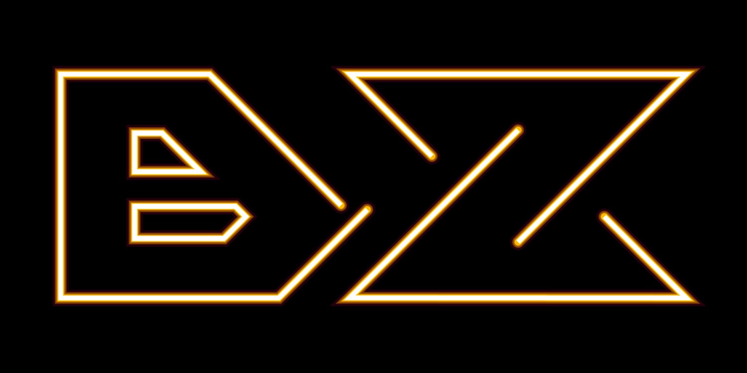
Had an idea for a design related to basic shapes, and having the letters B and Z morphing into them. I also thought about making the shapes related to the diamond and hourglass icons representing keyframes in AfterEffects which is my main tool.

After Effects timeline
As usual, always start with a sketch


And many iteration later - made a new logo

BZ icon standalone