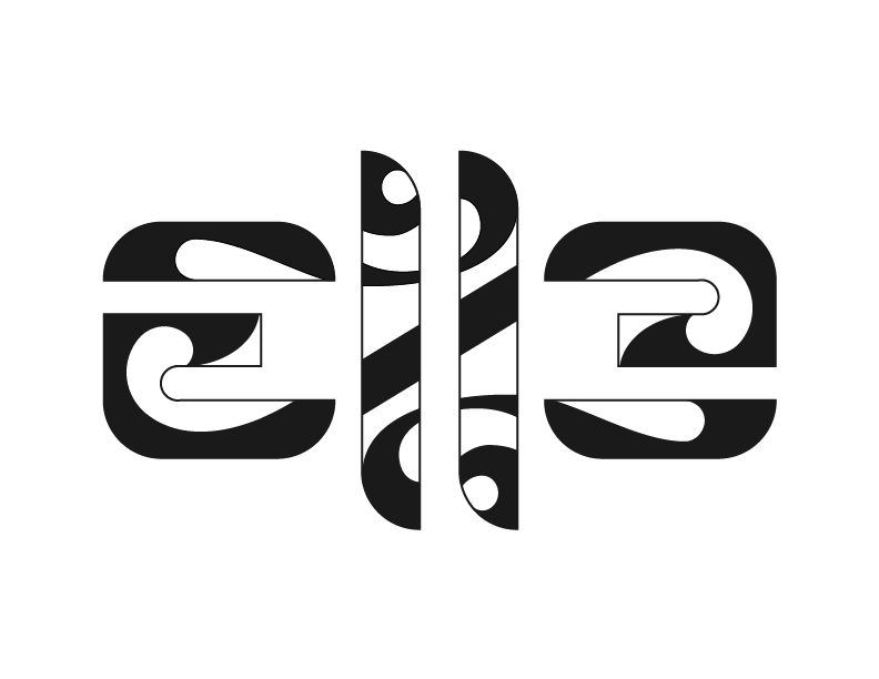
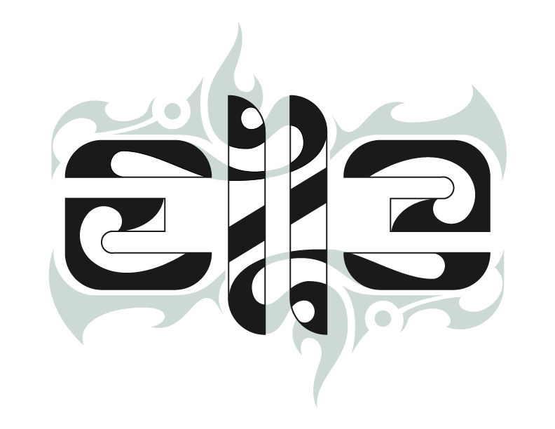
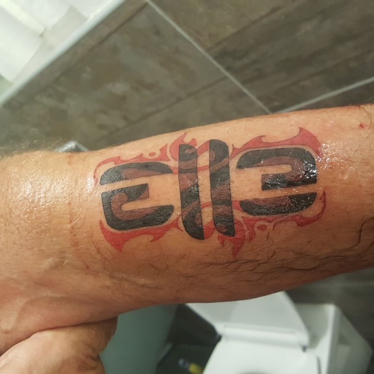
My father wanted to get a tattoo of the name 'Elle' - his newborn granddaughter and my niece. We are both fans of ambigram lettering, and since I design those from time to time he asked me to make an ambigram design for the name.
A quick FYI to explain what ambigrams are – these are words designed in a way that if you rotate the image 180 degrees (or in some case, mirror the image) you can read the same word or another word. If you've seen or read 'Angels and Demons' you'll remember the words 'earth' / 'air' / 'fire' / 'water' / 'illuminati' written in that way.
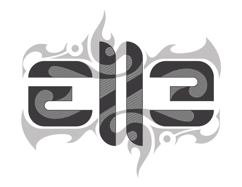
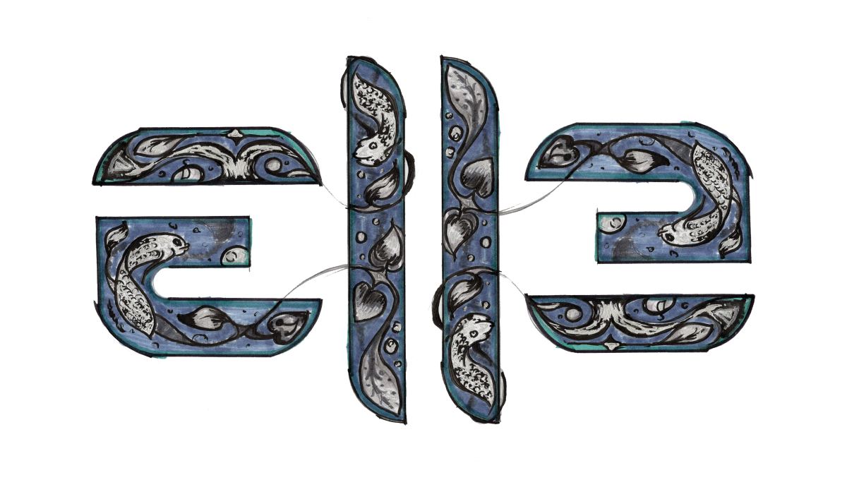
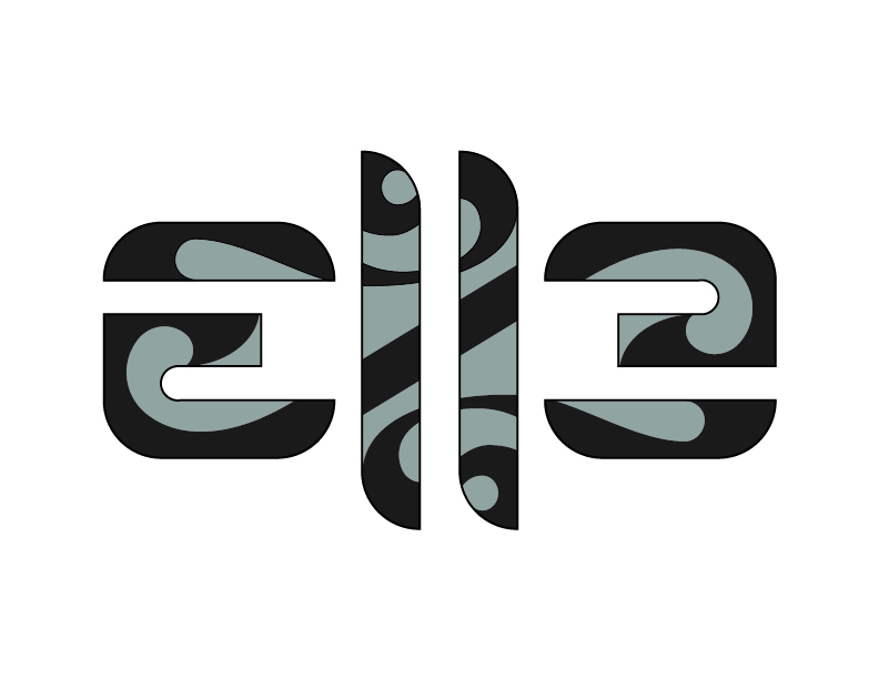
You can see the final version here.
The final design
So I thought I would share a little bit of the process:
First I tried to break down the letters to figure out what will be the best way to build it. Should it be all lowercase, all uppercase, or just the first letter.
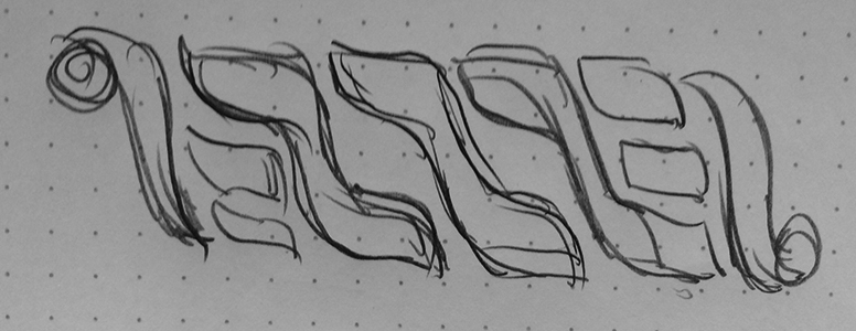
This sample shows a skeleton I built trying it with all uppercase design. This would not be the final design, I just call it "The Solve" – how to arrange the letters and decorated motifs to make this work.
Did another quick design just to feel if I should do a mirror instead of 180° rotation. I quickly discarded that idea.
At first I thought that all caps would be the best way. I tried a few different versions, modern and Gothic black letters.
My father liked the Gothic version but wanted me to try other options. I did a few Gothic ideas with all lowercase letters here :
Which he didn't like much. In the meanwhile I thought I'll try a few other all lowercase options such as:
Which he didn't like as well. I liked them at first but eventually had to agree with him. Knowing that he really likes Gothic style I tried another option with a sentence case solve ( spelling 'Elle'):
I also tried another all lowercase version which I thought was pretty successful, at least the first sample
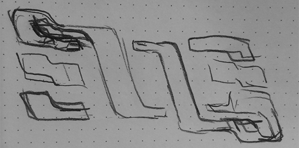
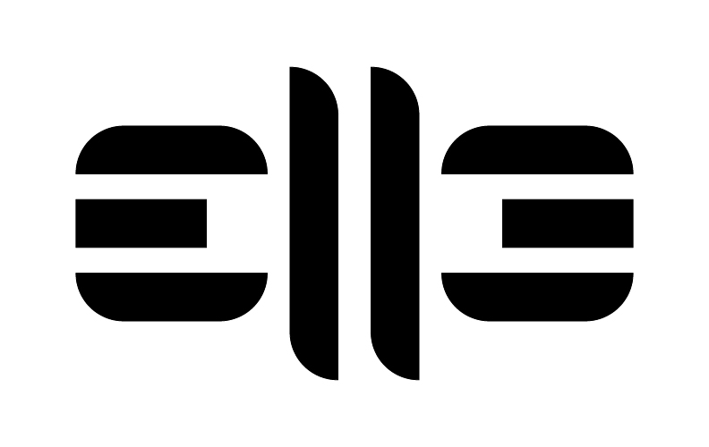
After all been said and done, and my dad not being completely sure about these (especially since it's going to be on his arm for posterity), he sent me a simple design idea.
He wanted to try his design but asked me to create some details in it, not to make it all solid black.
The design was really great and I must admit, I was a bit disappointed in myself and impressed by my dad who found a much better solve then all of the ones that I tried.
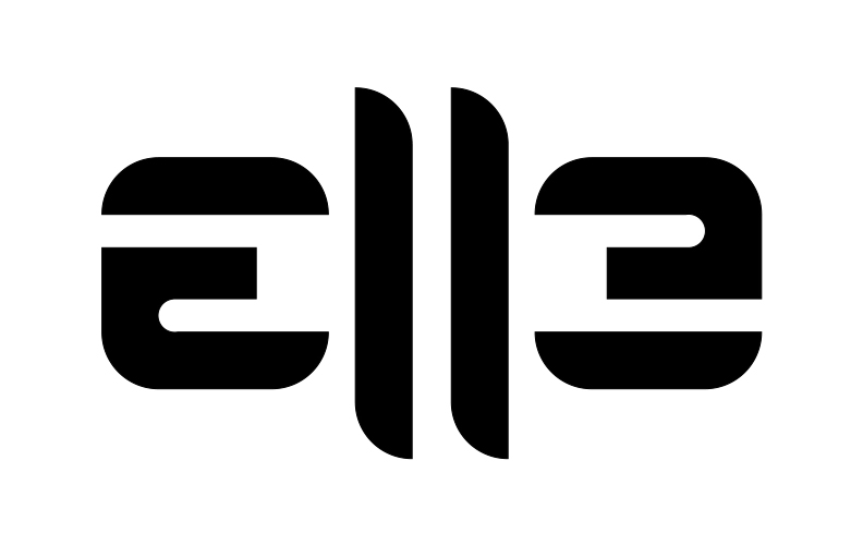
My only issue with his design was that it looked too much like 'EllE' . Since this is not how you would write the name with regular letters, I revised it to spell 'Elle'.
My father's original solve
My revised solve
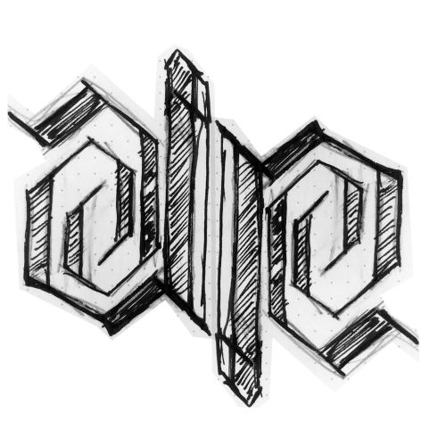
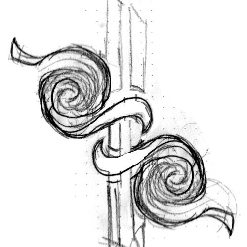
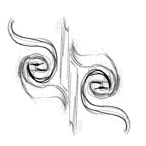
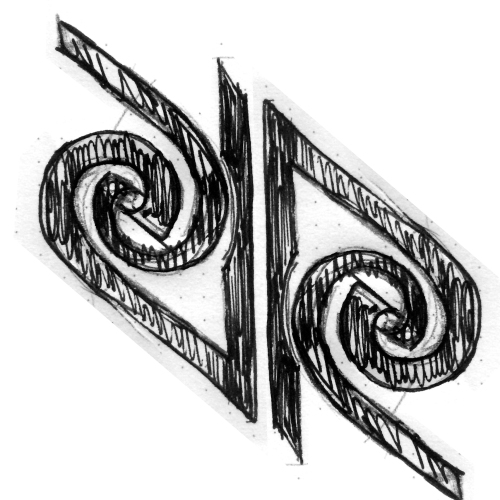
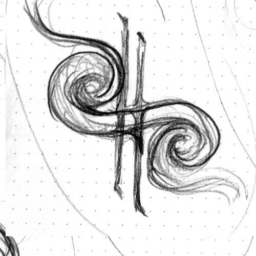
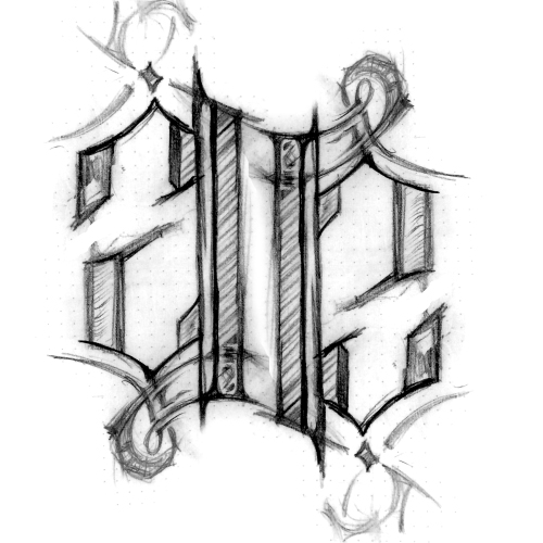
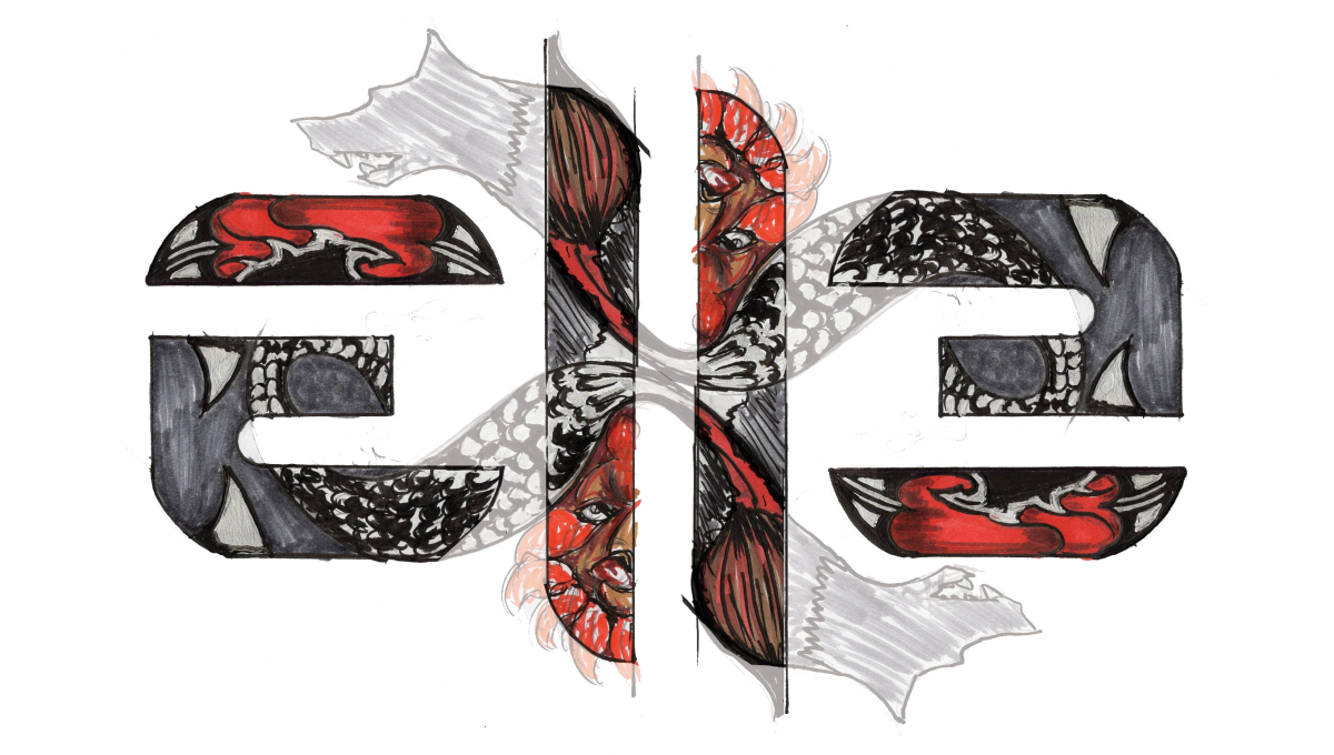
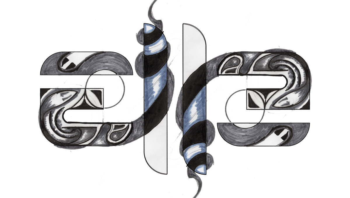
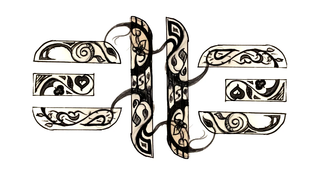
Now that we had a good solution I went on to design many different options for it. I tried a semi-Gothic one.
As well as several ones based on his design:
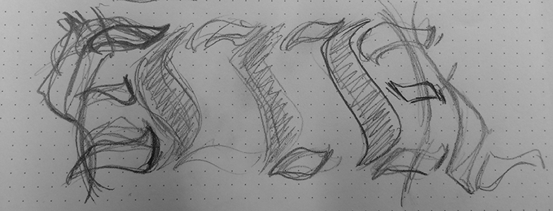
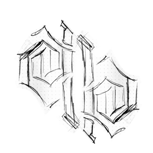
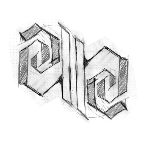
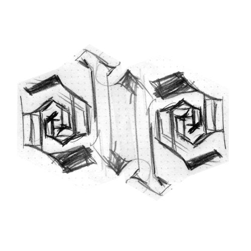
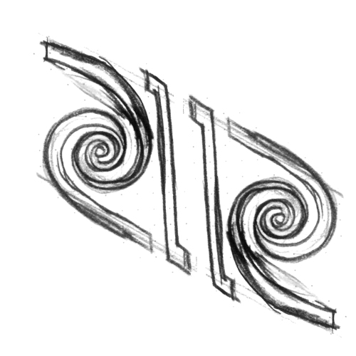
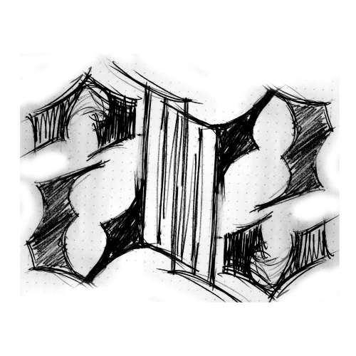
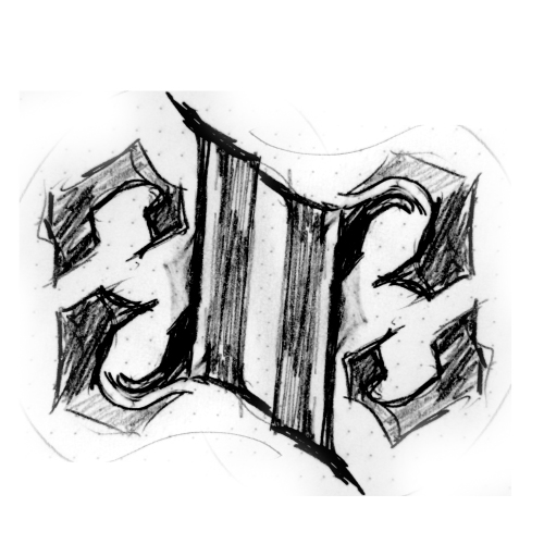
But I thought that bigger bolder shapes would be best so I did a few variations based on this sketch:
So yeah, after many many illustrations (and I only posted here about half of them) we finally had a very nice ambigram tattoo design - three generations in the making.
